Skip To Main Site Navigation
Skip To Content
Skip To Footer
Developer Notes
- The Header will be displayed on all pages of the site at the top of the page.
- The Header has been implemented using Partial Designs. It is located on
/sitecore/content/EH/Emory/Presentation/Partial Designs/Header.
- This partial is added to the Page Design.
- Child menu items of mobile Primary Navigation added dynamically. CA only needs to add the parent items through the Primary Navigation component.
General Components Structure of the Header
- Header Alert
- Section Container with ID
header-top-section
- Container with ID
top-header-left-section
- Rich Text - Phone Link variant
- EH Popup
- Container with ID
top-header-right-section
- Heading Link list - Header Links variant
- Search Box - Header variant
- Section Container
- Container with ID
main-header-container
- Image
- Container with ID
main-header-navigation-container--desktop
- Primary Navigation
- Link - Round Button variant
- Container with ID
main-header-navigation-container--mobile
- Link with class
mobile-search-btn
- Link with class
mobile-nav-btn
- Container with ID
mobile-search-panel
- Container with ID
mobile-menu-panel
- Container with ID
mobile-utility-nav
- Container
- Container with ID
navigation-mobile-wrapper
- Container with ID
navigation-mobile
- Link - Round Button variant
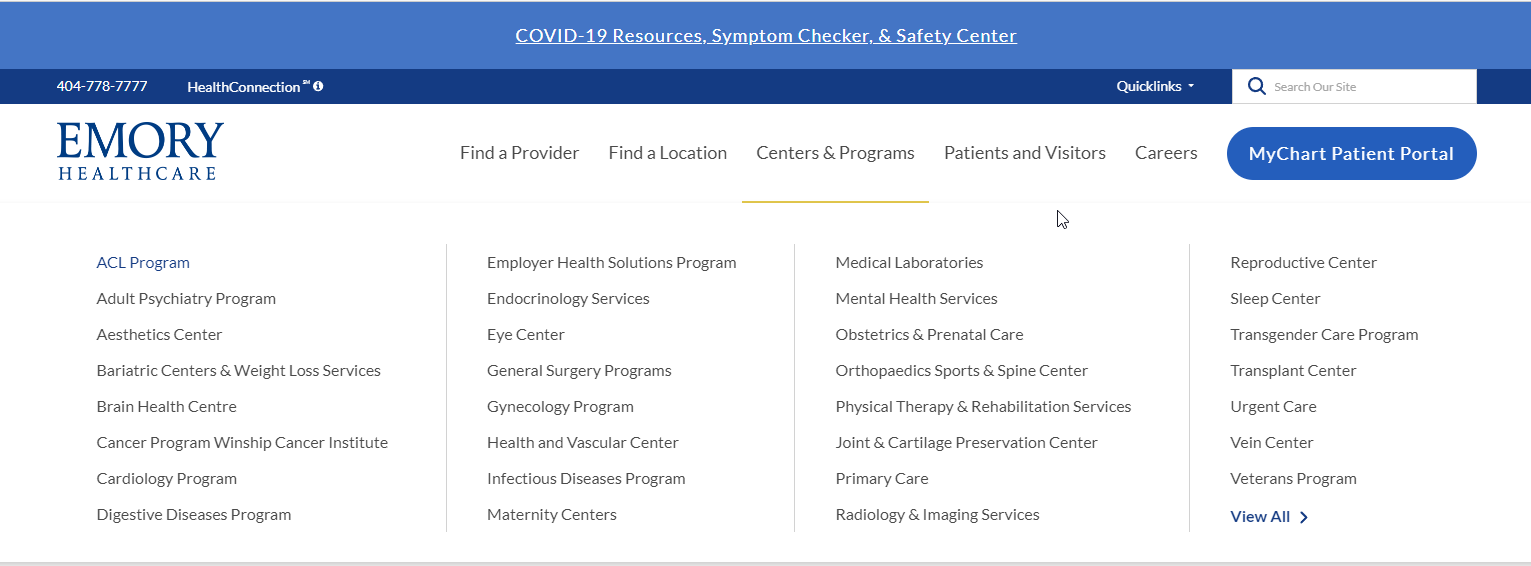
Requirements
Header:
- The CA can edit via the page design level.
- The Header should be displayed from every page on the website.
- The Header will be implemented based on the new designed found here: Designs
- The Header will contain the following elements:
- Header Container
- Click to Call
- Informational Popup
- Quick Link Menu
- Search Box
- Text inside of box- "Search our Site"
- Image Variant for logo (Links to home page)
- 5 Link list (flyout nav) Max of 6
- Button Link (My Portal)
- The header will be semi hidden upon scroll. Wen the user scrolls down it will be hidden and upon scrolling up it will re-appear.
- Click to open on Flyout for the primary nav should show or hide mega menu.
- Fly Out Nav Labels:
- Find a Provider
- Find a Location
- Centers & Programs
- Patients & Visitors
- Careers
- MyChart Patient Portal
- Styling should follow designs: Designs
- Underline should appear upon hover on all clickable links
- This component must follow accessibility standards for alt text, and keyboard navigation.
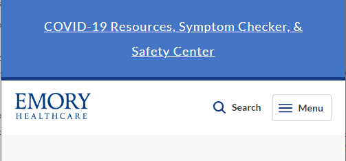
Mobile:
- See requirements above.
- Upon load in mobile, only the following elements should be displayed.
- Header logo image
- Search box
- Menu
- Expanded Menu will display click to call and Health Connection text. (Popup will not display in mobile)
- Expanded Menu will open to accordion, links will display tier 3 dropdown navigation.
- The Menu Button should convert to a close button with an X
- The primary topic-based navigation will be a slide-down, opened using the main menu "hamburger" menu icon.
- Quick links will display inside the mobile menu below the top navigation area.
- User can click on Quick links and links will appear in a list.
- The search name and icon turn into a toggle button to hide and show the search input area.
- The button link (My Portal) will show in the mobile menu at the bottom below the Quick links.
- A Back button should be displayed when the submenu is expanded.
- View All Link will display below the submenu links.
- For Styling please see: Designs